Make it look the way you wantGestalten Sie es so, wie Sie möchten
Theme, opening screen, top-card collapse, progress-bar animation, the monthly-vs-annual summary default, and how FirePath adapts to tablet landscape. Every toggle that changes how the app looks, in one place.Design, Startbildschirm, Einklappen der oberen Karten, Fortschrittsbalken-Animation, Standard für Monats- vs. Jahreszusammenfassung und wie FirePath sich an Tablet-Querformat anpasst. Jeder Umschalter, der das Aussehen der App verändert, an einem Ort.
{# Hero image is rendered twice — once for each locale — and one is
hidden by the lang toggle. The DE copy lives in a /de/ subfolder
under the same slug; we strip the trailing "hero.png" and re-add
"de/hero.png" so we don't need a custom template filter. Pattern
assumes hero_image_filename is always "/hero.png", which is
the convention enforced by the seed migrations. #}
Quick start
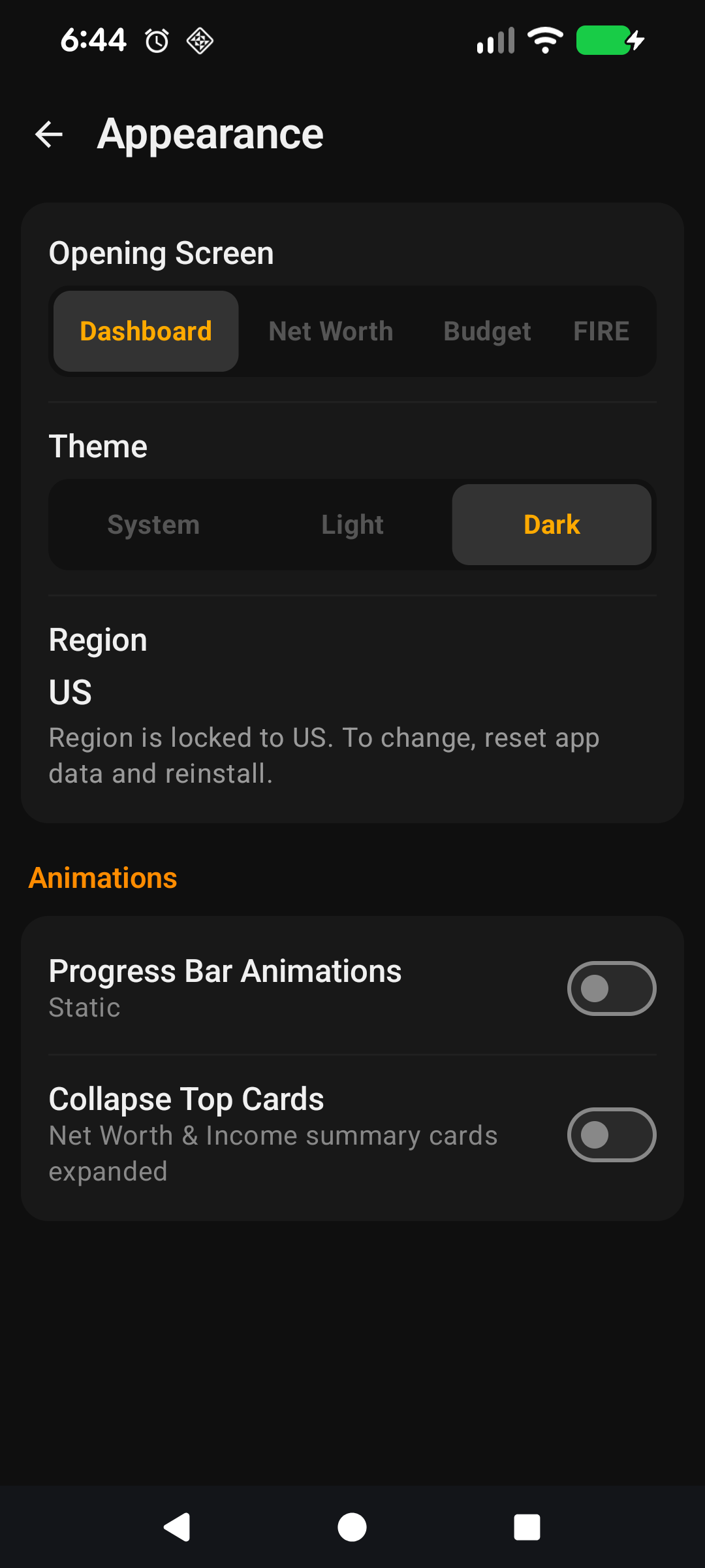
The Display section in Settings is where you change how FirePath looks and where it opens. Nothing here affects your data — it's purely the presentation layer, so feel free to experiment.
Theme — System, Light, or Dark. Dark is the default. System follows your phone's day/night switch automatically.
Opening Screen — which of the four main tabs loads when you launch the app: Dashboard, Net Worth, Income & Expenses, or FIRE.
Collapse top cards on scroll — when you scroll a list, the hero card at the top shrinks down to give you more room. Off by default.
Animate progress bars — the fill animation on FIRE progress bars when you open the FIRE screen. Off by default to keep things feeling instant.
Default Annual Summary — whether Income & Expenses opens showing monthly or yearly totals by default.
That's all most people ever change. If you want the why-and-how for each toggle, read on.
The rest of this guide is for users who want to tune the screen. If you're happy with the defaults, you can stop here — everything below is optional customisation.
Going deeper
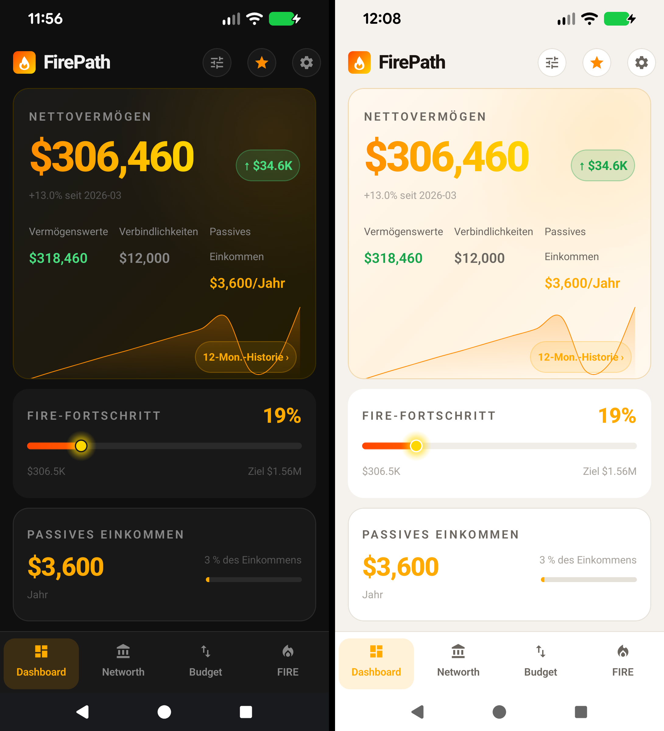
Theme
① Light theme. ② Dark theme (default). ③ Amber accent consistent across both.
Three choices:
System — FirePath follows whatever your phone's dark-mode setting is doing. If you use automatic day/night switching on Android, the app flips with it.
Light — white backgrounds, dark text. Most legible in bright outdoor light.
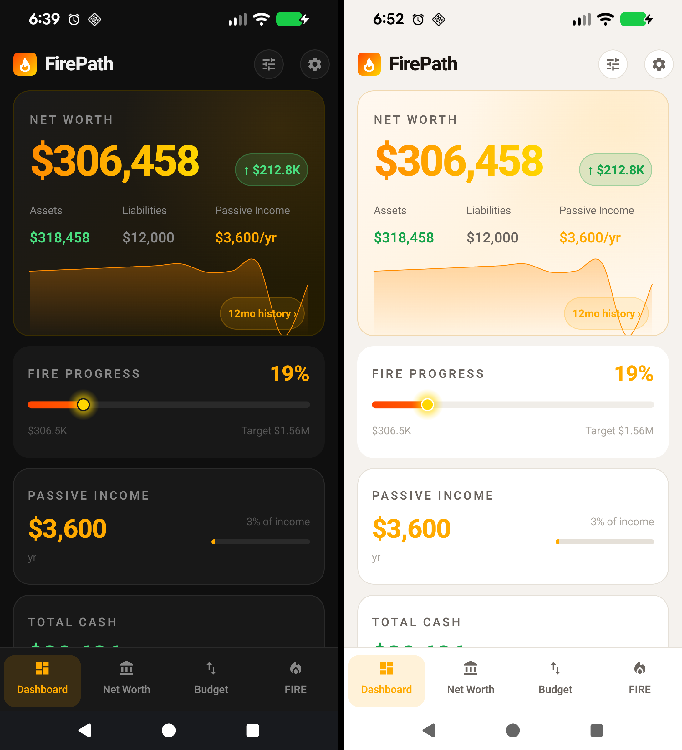
Dark — dark backgrounds, light text. Default because most users check net worth in bed or on the couch, and dark is easier on the eyes in low light. Also uses less battery on OLED screens.
The amber accent colour is the same across both themes — that's FirePath's brand colour and doesn't change with dark mode.
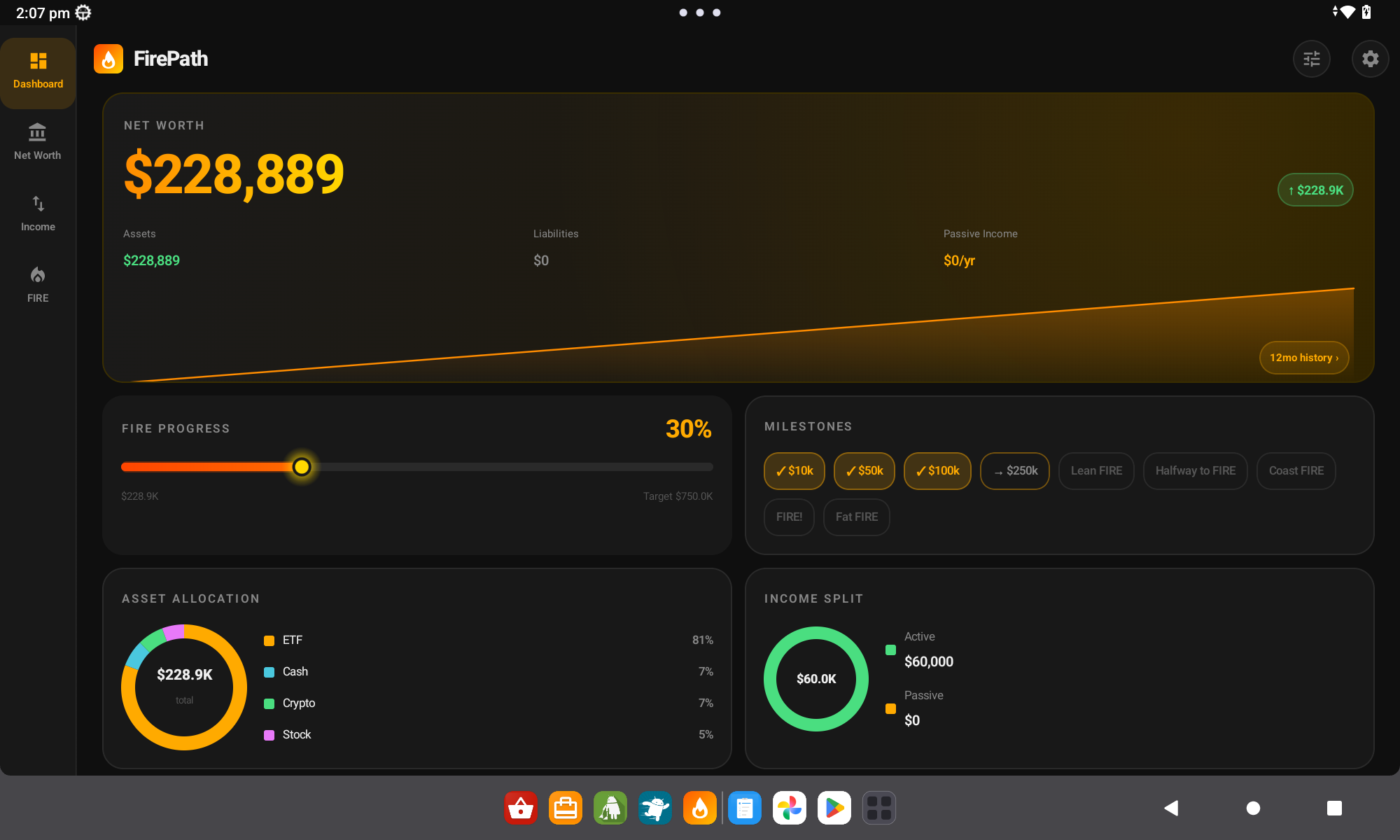
Opening Screen
① Dashboard (default). ② Net Worth / Income & Expenses / FIRE as alternatives.
Pick which of the four main tabs the app lands on when you open it.
Dashboard (default) — the at-a-glance summary. Good if you want the quick-check experience.
Net Worth — straight to the full assets/liabilities list. Good if you open the app mainly to log changes or update balances.
Income & Expenses — if your main use is budgeting rather than net-worth tracking.
FIRE — straight to the FIRE Calculator. For the goal-focused user who opens the app to check "how close am I?"
The bottom navigation bar doesn't change — all four tabs are always available. This setting only controls the landing tab.
Collapse top cards on scroll
On screens with a hero card at the top (Dashboard, Net Worth), this toggle makes the hero shrink as you scroll down. The big net-worth number stays visible but compact, giving the list below more breathing room on small phones.
Off by default because the hero is designed to be the first thing you see — collapsing it on scroll is a trade-off for users with a lot of rows. Turn it on if you have 30+ assets or a tall liability list and find yourself scrolling a lot.
Animate progress bars
When you open the FIRE screen, each variant (Lean / Regular / Fat / Coast) has a progress bar showing how close you are to that target. With this toggle on, the bars fill from zero to their value over about half a second — a visual effect.
Off by default because the screen feels snappier when the bars just appear at their correct length. Turn it on if you like the effect — it's a personal preference thing, no functional difference.
Default Annual Summary
Controls the monthly-vs-yearly toggle on the Income & Expenses screen. With this on, the screen opens showing yearly totals by default; with it off, monthly totals. You can always flip the chip on the screen itself — this is just what it defaults to every time you open the app fresh.
Pick annual if you think in yearly terms ("I want to save $30k/year"), pick monthly if you think in cashflow terms ("I have $2.5k left each month"). Both work; neither is more correct.
Tablet landscape — no toggle, automatic
① Auto-switches at ≥840dp. ② Asset-allocation donut appears on the right.
There's no tablet mode setting because FirePath detects your available width and adjusts layouts automatically. At 840dp wide or more (tablet landscape, big phone landscape, Chromebook), the app:
Splits the Dashboard into two columns with the asset-allocation donut chart showing on the right.
Shows Net Worth assets and liabilities side-by-side instead of in a tabbed view.
Widens the FIRE chart to span the full screen rather than stacking cards.
If you rotate a tablet from portrait to landscape, the layout re-flows instantly. Nothing to configure.
Why there aren't more display knobs
Font size, card density, chart colours — all things other apps expose as settings. FirePath deliberately doesn't, for two reasons:
Font size — Android's system-wide font-scale setting already handles this. If you bump up your phone's text size, FirePath scales with it.
Colours — consistent amber/green/red across the app makes the at-a-glance reading of "up or down?" instant. Per-user colour themes undermine that.
If you find yourself wanting a knob that isn't here, email us — most requests have a story behind them we'd like to hear.
Collapse top cards on scroll — Settings → Display.
Animate progress bars — Settings → Display.
Default Annual Summary — Settings → Display. Changes the default view on Income & Expenses (you can still flip the monthly/yearly chip on the screen itself).
Schnellstart
Der Abschnitt Anzeige in den Einstellungen ist der Ort, an dem Sie ändern, wie FirePath aussieht und wo es öffnet. Nichts hier beeinflusst Ihre Daten — es ist rein die Präsentationsebene, also experimentieren Sie ruhig.
Design — System, Hell oder Dunkel. Dunkel ist Standard. System folgt automatisch dem Tag-/Nacht-Wechsel Ihres Telefons.
Startbildschirm — welcher der vier Haupt-Tabs beim Starten der App geladen wird: Dashboard, Nettovermögen, Einnahmen & Ausgaben oder FIRE.
Obere Karten beim Scrollen einklappen — wenn Sie eine Liste scrollen, schrumpft die Hero-Karte oben, um mehr Platz zu schaffen. Standardmäßig aus.
Fortschrittsbalken animieren — die Füllanimation der FIRE-Fortschrittsbalken beim Öffnen des FIRE-Bildschirms. Standardmäßig aus, damit alles sofortig wirkt.
Standard-Jahreszusammenfassung — ob Einnahmen & Ausgaben standardmäßig monatliche oder jährliche Summen zeigt.
Das ist alles, was die meisten jemals ändern. Wenn Sie das Warum und Wie zu jedem Umschalter wollen, lesen Sie weiter.
Der Rest dieser Anleitung ist für Nutzer, die den Bildschirm anpassen möchten. Wenn Sie mit den Standardeinstellungen zufrieden sind, können Sie hier aufhören — alles unten ist optionale Anpassung.
Tiefer eintauchen
Design
① Helles Design. ② Dunkles Design (Standard). ③ Bernsteinfarbener Akzent in beiden konsistent.
Drei Auswahlmöglichkeiten:
System — FirePath folgt dem, was die Dunkelmodus-Einstellung Ihres Telefons macht. Wenn Sie auf Android automatisches Tag-/Nacht-Umschalten nutzen, wechselt die App mit.
Hell — weiße Hintergründe, dunkler Text. Am besten lesbar bei hellem Außenlicht.
Dunkel — dunkle Hintergründe, heller Text. Standard, weil die meisten Nutzer ihr Nettovermögen im Bett oder auf der Couch prüfen, und Dunkel ist bei wenig Licht augenfreundlicher. Spart auch Akku auf OLED-Bildschirmen.
Die bernsteinfarbene Akzentfarbe ist in beiden Designs gleich — das ist FirePaths Markenfarbe und ändert sich nicht mit dem Dunkelmodus.
Startbildschirm
① Dashboard (Standard). ② Nettovermögen / Einnahmen & Ausgaben / FIRE als Alternativen.
Wählen Sie, auf welchem der vier Haupt-Tabs die App beim Öffnen landet.
Dashboard (Standard) — die Zusammenfassung auf einen Blick. Gut, wenn Sie die Schnellcheck-Erfahrung wollen.
Nettovermögen — direkt zur vollständigen Vermögens-/Verbindlichkeitsliste. Gut, wenn Sie die App hauptsächlich öffnen, um Änderungen zu protokollieren oder Salden zu aktualisieren.
Einnahmen & Ausgaben — wenn Ihre Hauptnutzung Budgetierung statt Nettovermögens-Tracking ist.
FIRE — direkt zum FIRE-Rechner. Für den zielorientierten Nutzer, der die App öffnet, um zu prüfen "wie nah bin ich dran?"
Die untere Navigationsleiste ändert sich nicht — alle vier Tabs sind immer verfügbar. Diese Einstellung steuert nur den Landing-Tab.
Obere Karten beim Scrollen einklappen
Auf Bildschirmen mit einer Hero-Karte oben (Dashboard, Nettovermögen) lässt dieser Umschalter das Hero-Element beim Scrollen nach unten schrumpfen. Die große Nettovermögen-Zahl bleibt sichtbar, aber kompakt, und gibt der Liste darunter mehr Luft auf kleinen Telefonen.
Standardmäßig aus, weil das Hero-Element so gestaltet ist, dass es das Erste ist, was Sie sehen — das Einklappen beim Scrollen ist ein Kompromiss für Nutzer mit vielen Zeilen. Aktivieren Sie es, wenn Sie 30+ Vermögenswerte oder eine lange Verbindlichkeitsliste haben und sich beim Scrollen wiederfinden.
Fortschrittsbalken animieren
Wenn Sie den FIRE-Bildschirm öffnen, hat jede Variante (Lean / Regular / Fat / Coast) einen Fortschrittsbalken, der zeigt, wie nah Sie am Ziel sind. Mit diesem Umschalter an füllen sich die Balken von Null bis zu ihrem Wert über etwa eine halbe Sekunde — ein visueller Effekt.
Standardmäßig aus, weil der Bildschirm schneller wirkt, wenn die Balken einfach in ihrer korrekten Länge erscheinen. Aktivieren Sie es, wenn Sie den Effekt mögen — es ist eine Geschmacksfrage, kein funktionaler Unterschied.
Standard-Jahreszusammenfassung
Steuert den Monats-gegen-Jahres-Umschalter auf dem Einnahmen-&-Ausgaben-Bildschirm. Mit diesem an öffnet sich der Bildschirm standardmäßig mit Jahressummen; mit aus mit Monatssummen. Sie können den Chip auf dem Bildschirm selbst jederzeit umschalten — dies ist nur die Vorgabe, mit der er sich jedes Mal neu öffnet.
Wählen Sie jährlich, wenn Sie in Jahreszahlen denken ("Ich möchte 30.000 $/Jahr sparen"), wählen Sie monatlich, wenn Sie in Cashflow-Zahlen denken ("Ich habe 2.500 $ pro Monat übrig"). Beides funktioniert; keines ist richtiger.
Tablet-Querformat — kein Umschalter, automatisch
① Automatischer Wechsel ab ≥840dp. ② Vermögensaufteilungs-Donut erscheint rechts.
Es gibt keine Einstellung für den Tablet-Modus, weil FirePath Ihre verfügbare Breite erkennt und Layouts automatisch anpasst. Bei 840dp Breite oder mehr (Tablet-Querformat, großes Telefon im Querformat, Chromebook) geht die App wie folgt vor:
Teilt das Dashboard in zwei Spalten mit dem Vermögensaufteilungs-Donut-Diagramm rechts.
Zeigt Nettovermögen-Vermögenswerte und -Verbindlichkeiten nebeneinander statt in einer Tab-Ansicht.
Verbreitert das FIRE-Diagramm über den gesamten Bildschirm, statt Karten zu stapeln.
Wenn Sie ein Tablet vom Hoch- ins Querformat drehen, fließt das Layout sofort neu. Nichts zu konfigurieren.
Warum es nicht mehr Anzeige-Regler gibt
Schriftgröße, Kartendichte, Diagrammfarben — alles Dinge, die andere Apps als Einstellungen freigeben. FirePath tut das bewusst nicht, aus zwei Gründen:
Schriftgröße — Androids systemweite Schriftskalierungs-Einstellung erledigt das bereits. Wenn Sie die Textgröße Ihres Telefons erhöhen, skaliert FirePath mit.
Farben — konsistentes Bernstein/Grün/Rot in der ganzen App macht das Ablesen auf einen Blick von "hoch oder runter?" sofort klar. Benutzerspezifische Farbthemen untergraben das.
Wenn Sie sich einen Regler wünschen, der nicht hier ist, schreiben Sie uns — die meisten Anfragen haben eine Geschichte dahinter, die wir gerne hören.
Machen Sie es zu Ihrem — Einstellungen, die diesen Bildschirm beeinflussen
Standard-Jahreszusammenfassung — Einstellungen → Anzeige. Ändert die Standardansicht auf Einnahmen & Ausgaben (Sie können den Monats-/Jahres-Chip auf dem Bildschirm selbst weiterhin umschalten).